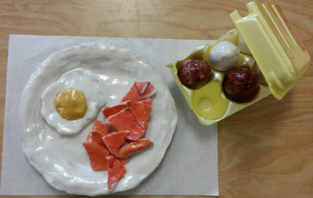
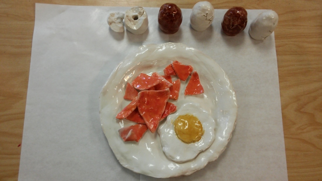
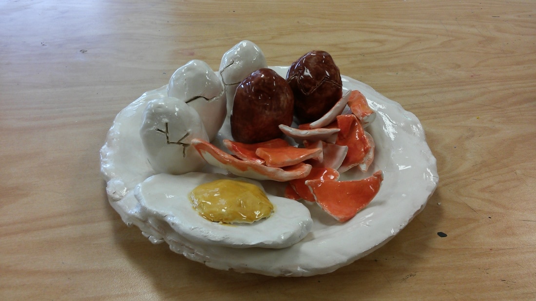
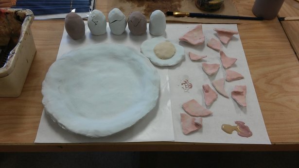
My final view of my clay project!!
2. What was the most difficult part of this project?
I thought the most difficult part was making the shapes of everything. Using and building with the clay was a lot harder than I anticipated.
3. Did your color choices work together harmoniously?
I think they all came out color wise they worked out nicely. The white, red, yellow, and brown helped out adding more vibrant and the glaze helped it make it more colorful.
4. Is your sculpture interesting from all views?
I think it is overall, it’s interesting, I called it “misfortune” for a reason why. Like I said also glazing it was adding the vibrant textures.
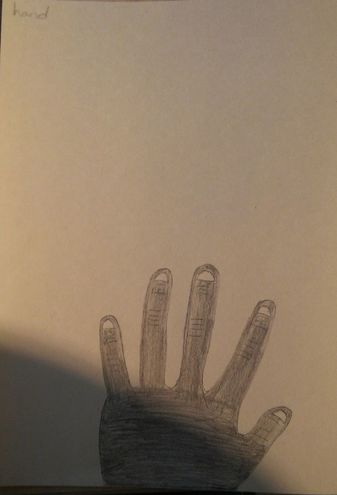
5. Describe the differences in constructing a sculpture and doing something 2D.
The 2D is a little bit easier and then sculpting it 3D was fun but a lot harder. It’s not like you can draw it and it looks like that.
6. How did you create textures in your sculpture?
Put two of the same colors on top and then add a third layer for extra colors or combing two as a third layer. If you don’t want that much vibrant color to it just add lighter layer, kinda don’t put that much of that one color.
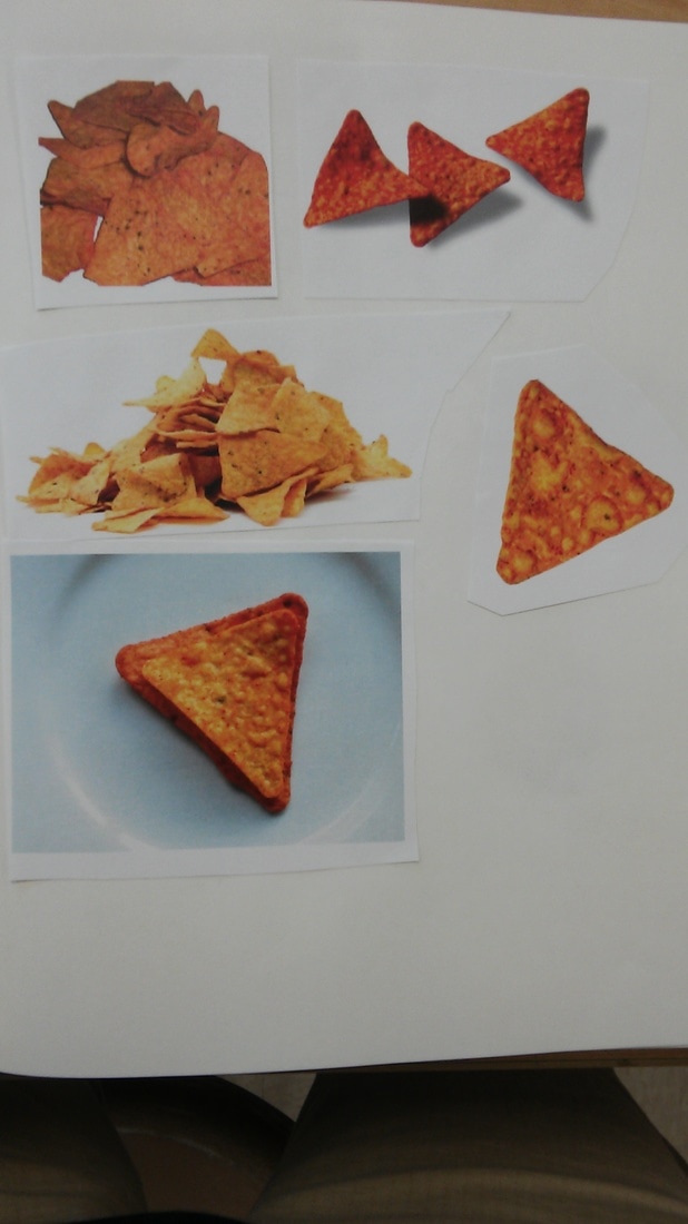
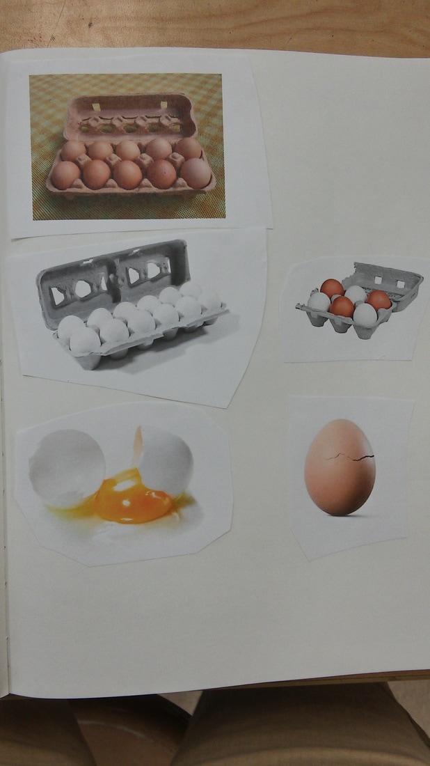
7. Does your sculpture look like the actual food? How did you accomplish this?
For the most part I think it kind of does. Out of all it the fried egg looks the most real out of all it. Adding the right amount the same color or doing the same but adding combined colors to it.
8. What would you do differently if you were to do this project again?
I would keep all the same but when going back with the glaze making sure what layers of colors I did. Getting all of the glaze on all of the spots that needed to be glazed were glazed. But since it was my first time glazing it didn’t bug me as bad.
- Describe the craftsmanship of your sculpture. (Is it neat and well executed?)
2. What was the most difficult part of this project?
I thought the most difficult part was making the shapes of everything. Using and building with the clay was a lot harder than I anticipated.
3. Did your color choices work together harmoniously?
I think they all came out color wise they worked out nicely. The white, red, yellow, and brown helped out adding more vibrant and the glaze helped it make it more colorful.
4. Is your sculpture interesting from all views?
I think it is overall, it’s interesting, I called it “misfortune” for a reason why. Like I said also glazing it was adding the vibrant textures.
5. Describe the differences in constructing a sculpture and doing something 2D.
The 2D is a little bit easier and then sculpting it 3D was fun but a lot harder. It’s not like you can draw it and it looks like that.
6. How did you create textures in your sculpture?
Put two of the same colors on top and then add a third layer for extra colors or combing two as a third layer. If you don’t want that much vibrant color to it just add lighter layer, kinda don’t put that much of that one color.
7. Does your sculpture look like the actual food? How did you accomplish this?
For the most part I think it kind of does. Out of all it the fried egg looks the most real out of all it. Adding the right amount the same color or doing the same but adding combined colors to it.
8. What would you do differently if you were to do this project again?
I would keep all the same but when going back with the glaze making sure what layers of colors I did. Getting all of the glaze on all of the spots that needed to be glazed were glazed. But since it was my first time glazing it didn’t bug me as bad.
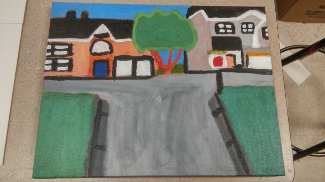
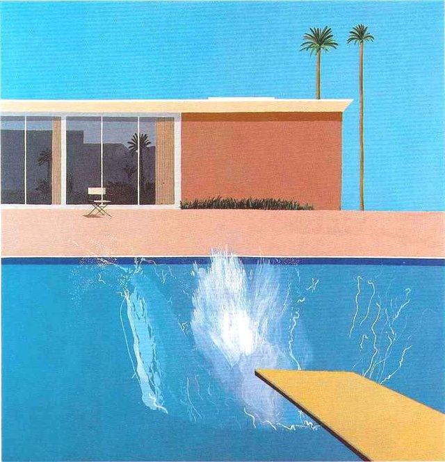
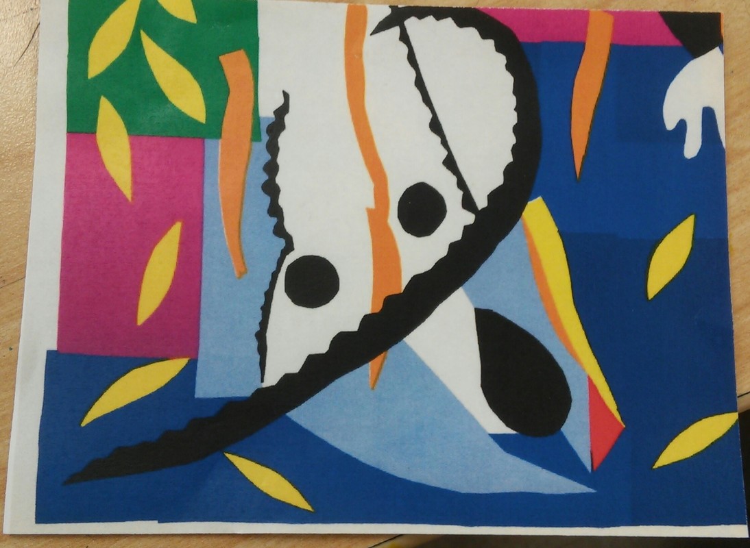
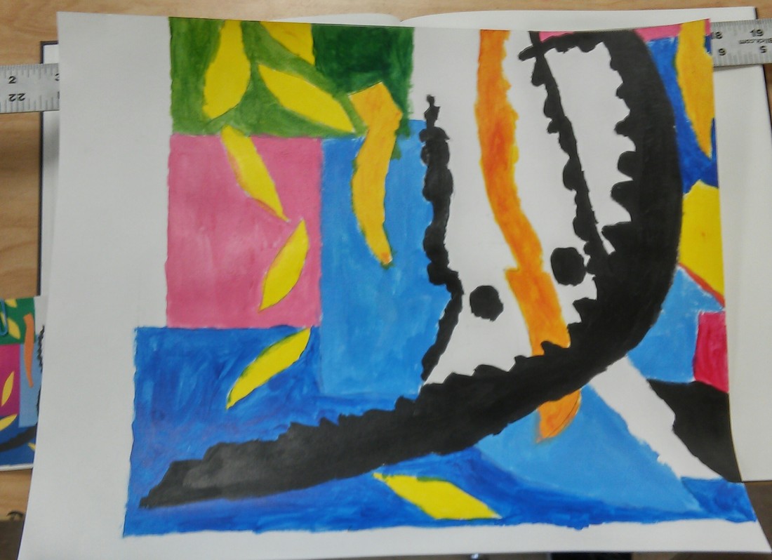
Who was your referenced artist for the painting? Name 4 main ideas you used from your research to create your painting.
Name- David Hockney
1. Bright colors
2. Bold colors
3. Vibrant
4. Colorful
Describe the craftsmanship of your painting. (Is it neat and well executed?)
i thought it came out well, i tried my best. The smaller details where harder to get in and suprisingly using bright and bold colors where harder to use than i thought.
What was the most difficult part of this project?
Getting in the fine details, and constanly making the same color so i used enough before i ran out.
Describe your color choices and how they reflect the work of your chosen artist?
I used bright and bold colors to atleast match up with David's art work. It reflects off of just using the colors.
Describe how the style of your landscape reflects your chosen artist.
I chose the landscape because it was bright and colorful and aswell somthing that was overall easier for me to color more so than my other ones and im glad i chose the one i did because out of all of them this one was a easier one to come to me in colors.
What do you think your chosen artist would say if he or she could see your painting today?
I really dont know,its hard to say. He might would say i did not too bad of a job.
What would you do differently if you were to do this project again
Try to keep track of what colors i need to make a lot of and little of. Maybe using a smaller and bigger brush for differnt parts. But i think this one came out ok.
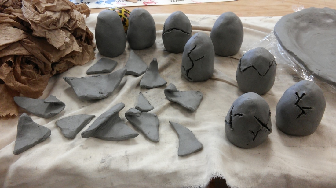
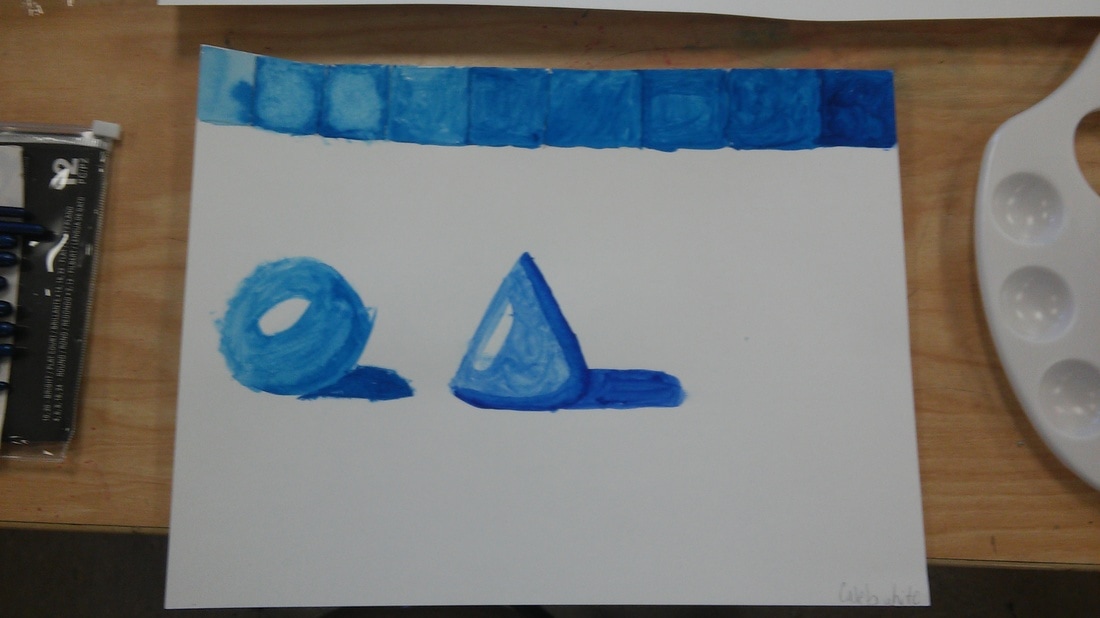
This is when i was adding texture to the eggs ,the plate,and doritos.
|
|
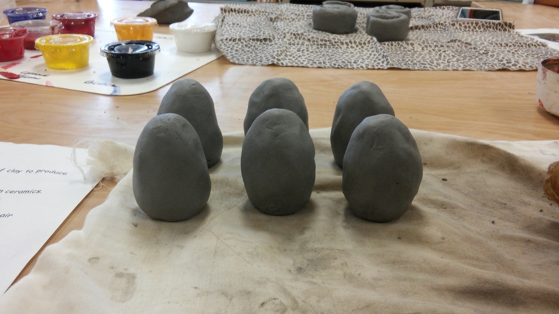
This was when i was making the eggs in shape because it was a lot harder to make than i thought.
my mini painting looks great overall, some things i thought were hard was keeping the akrillic paint in specific spots and making sure i color blend properly, i was glad with the little pictute i got. My Painting has always been kinda hard especially with akrillic.
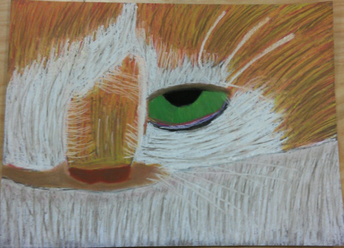
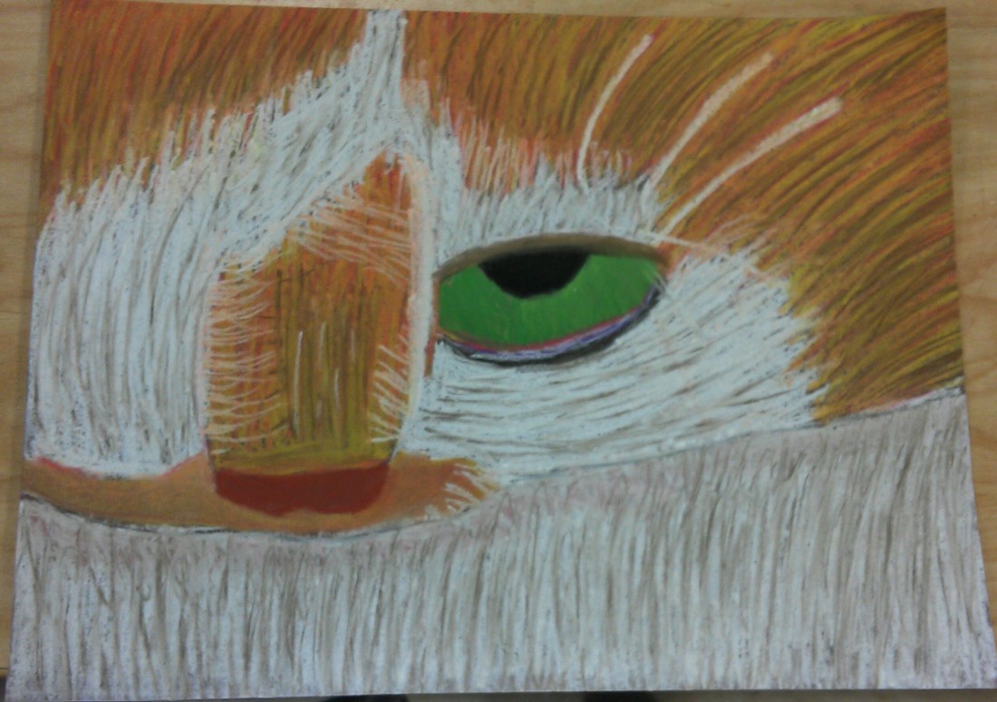
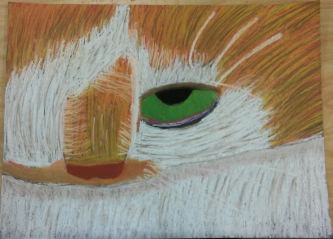
Describe the craftsmanship of your drawing. (Is it neat and well executed?)
I think overallmy craftmanship came out great. I thought my lines and my overall color combong came out nice with the exception of the white. I tbought my white did nott come out as good.
Do you think you used a full range of values to create the illusion of depth?
I tried my best on that, but however it came out not as good as i intened too but i tried my best we are still learning.
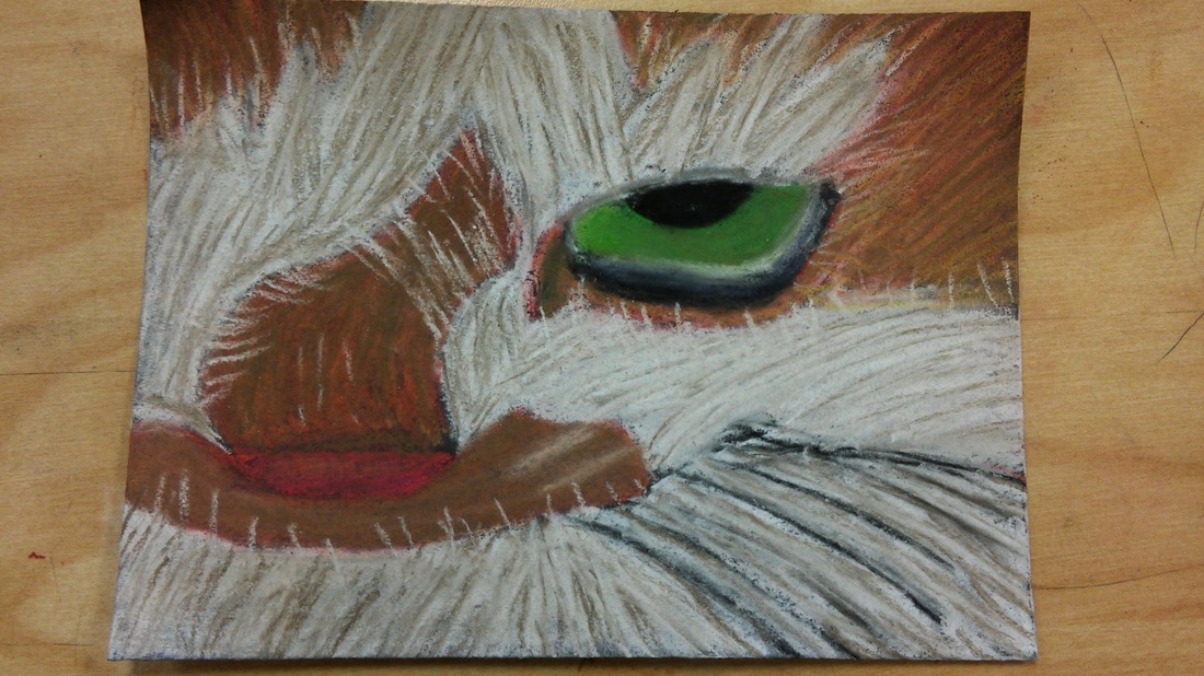
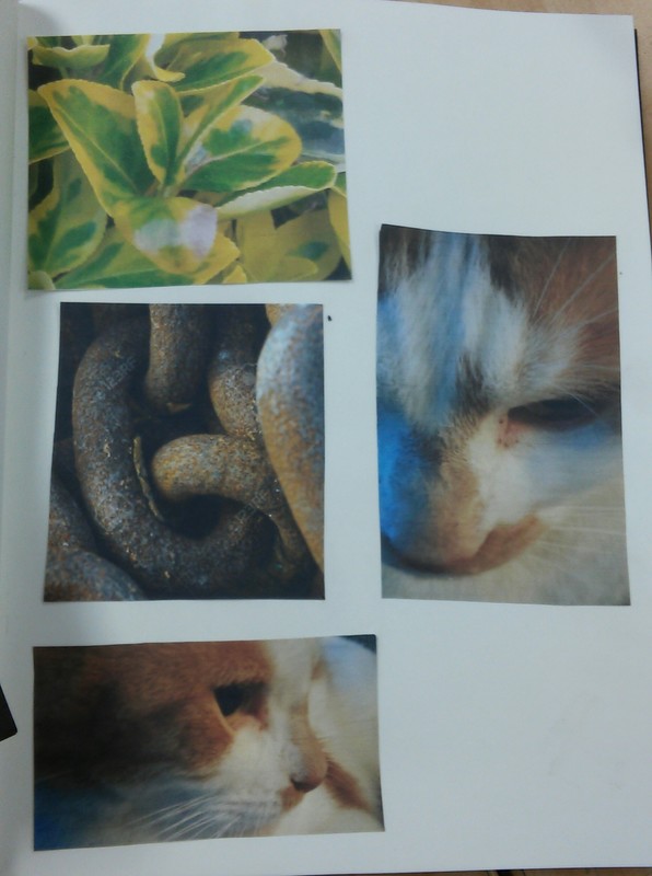
How do you think you represented the style of the artist Georgia O’ Keeffe?
I like the idea of the close depth of objects but getting those details is a lot harder than it looks. I thinl overall i did a good representation of the art style.
Describe your choice of colors/color harmonies and how you used them throughout the artwork?
I liked how i combined the red,yellow,brown, and white together. i thought making the texture for the fur looked great and i like the purple,black,green, and white on the eye aswell.
How did you create contrast in your drawing?
Trying to make the contrast was a little bit harder than i thought, making darker and lighter parts was a little bit of a challange. Such as progressing from the head to the neck was kind hard.
How did you use textures, highlights and shadows to enhance your artwork?
The texture was great, highlights were overall not too bad. Shadowing was hard but not on the eye but the neck part was hard.
Describe any difficulties you had creating your drawing and what you could do to improve your drawing? I overall thought it came out great i wish i could make the depth on his neck better and along with shadowing was a challange.
I think my combing values and my lines for the hair came out very nice looking.
I think overallmy craftmanship came out great. I thought my lines and my overall color combong came out nice with the exception of the white. I tbought my white did nott come out as good.
Do you think you used a full range of values to create the illusion of depth?
I tried my best on that, but however it came out not as good as i intened too but i tried my best we are still learning.
How do you think you represented the style of the artist Georgia O’ Keeffe?
I like the idea of the close depth of objects but getting those details is a lot harder than it looks. I thinl overall i did a good representation of the art style.
Describe your choice of colors/color harmonies and how you used them throughout the artwork?
I liked how i combined the red,yellow,brown, and white together. i thought making the texture for the fur looked great and i like the purple,black,green, and white on the eye aswell.
How did you create contrast in your drawing?
Trying to make the contrast was a little bit harder than i thought, making darker and lighter parts was a little bit of a challange. Such as progressing from the head to the neck was kind hard.
How did you use textures, highlights and shadows to enhance your artwork?
The texture was great, highlights were overall not too bad. Shadowing was hard but not on the eye but the neck part was hard.
Describe any difficulties you had creating your drawing and what you could do to improve your drawing? I overall thought it came out great i wish i could make the depth on his neck better and along with shadowing was a challange.
I think my combing values and my lines for the hair came out very nice looking.
sorry for the extremly big gap of differnces i was workong extremly hard on it.
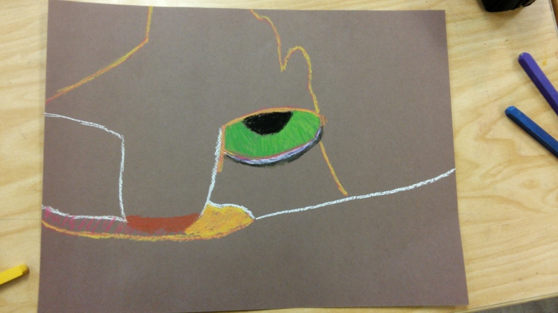
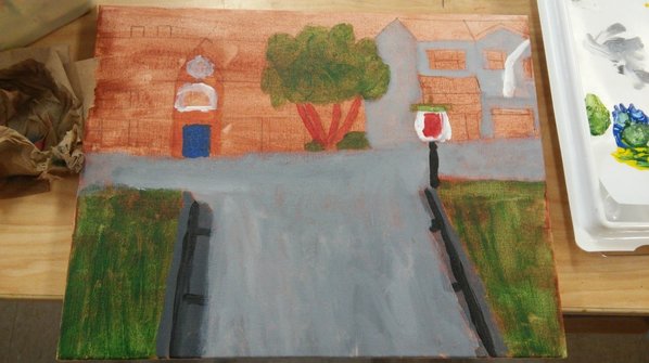
Draft
overall my drawing came out ok. the shadowing i thought was not to bad then trying to mix the colors was a little difficult and then shading on the fruit was hard, i did the little circle trick and that was good but it took a long a time to do.
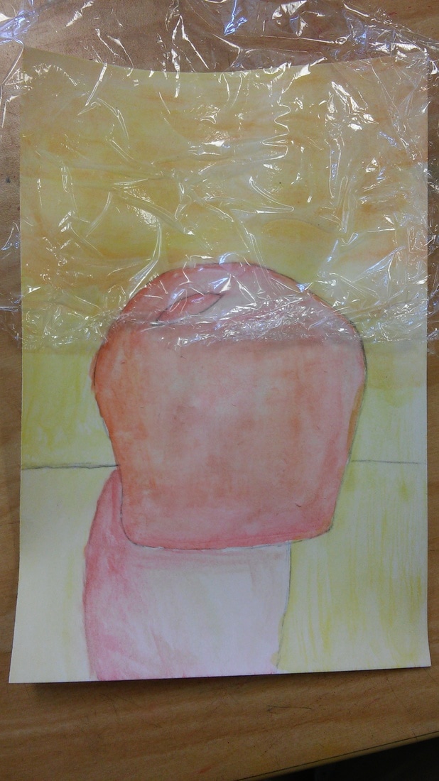
(fixing up the saran mistakes).
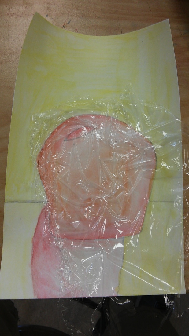
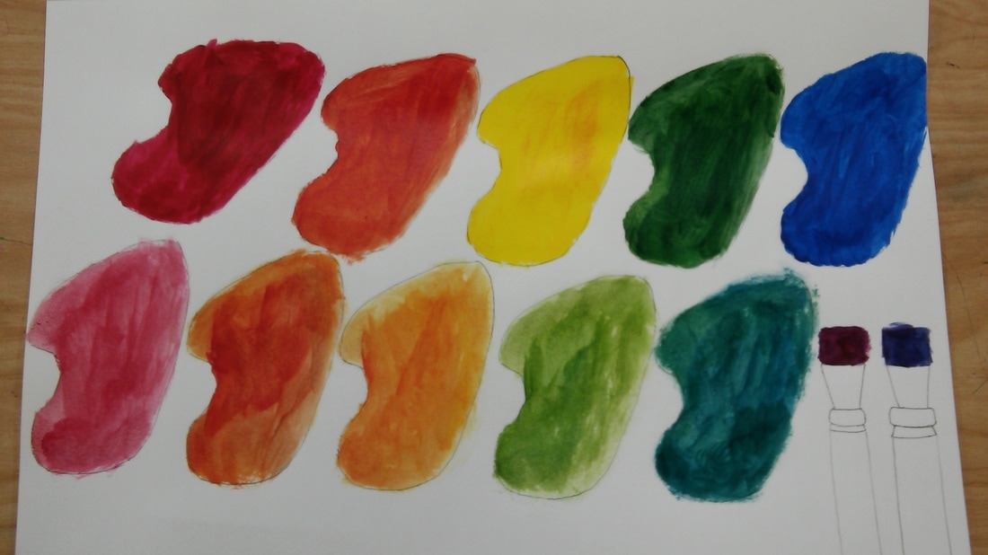
I used warm colors (saran) and complementery water colors and tradtional colored pencils.
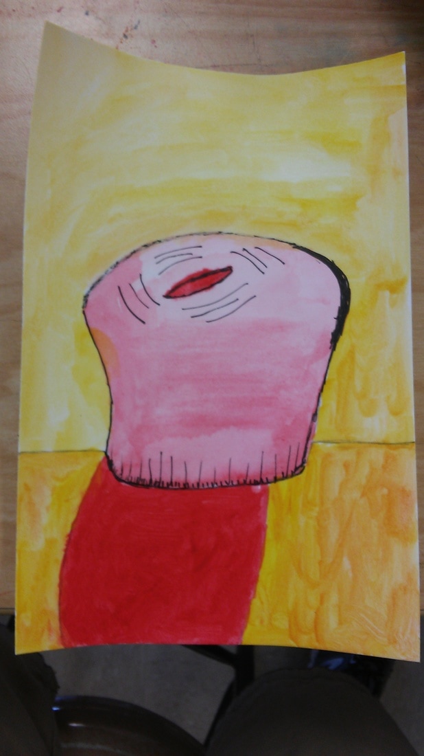
I used Warm colors (red) and choice of pen or ink added.
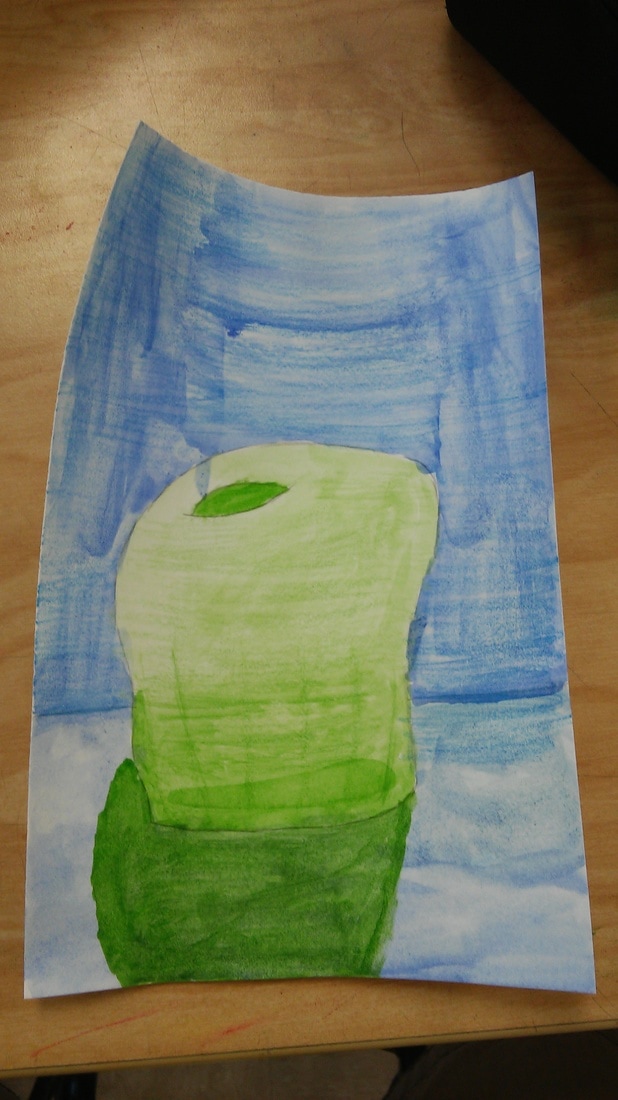
I used cool colors (green) and a choice of water OR traditional colored pencils.
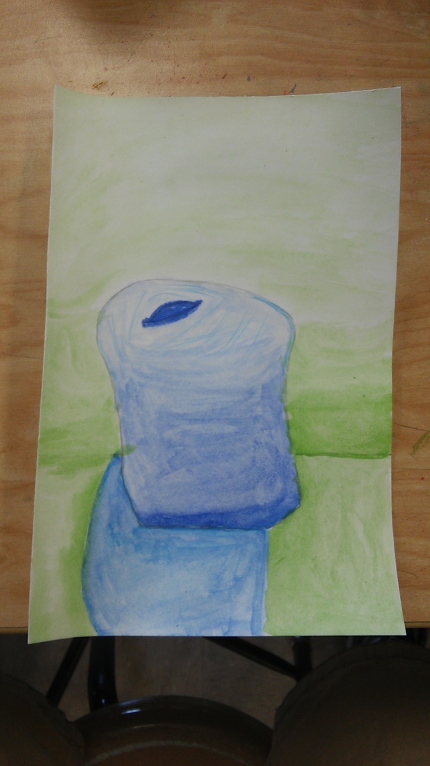
i had used cool colors (blue) and water color (blue,green,and orange).
Discuss your decision on pen and ink techniques. Why you chose to use one or more.
i chose to use more becuase if i used only one technique it would not have been bland. And as well i liked to do the hatching and the dotting.
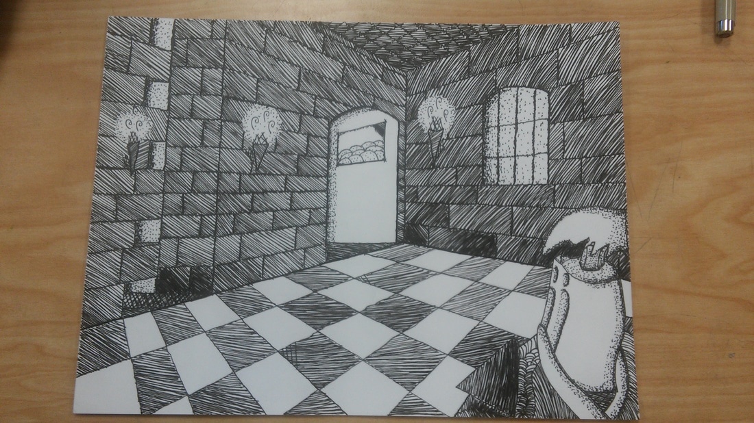
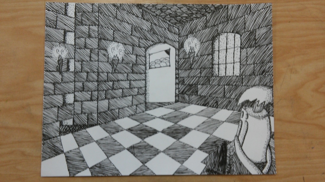
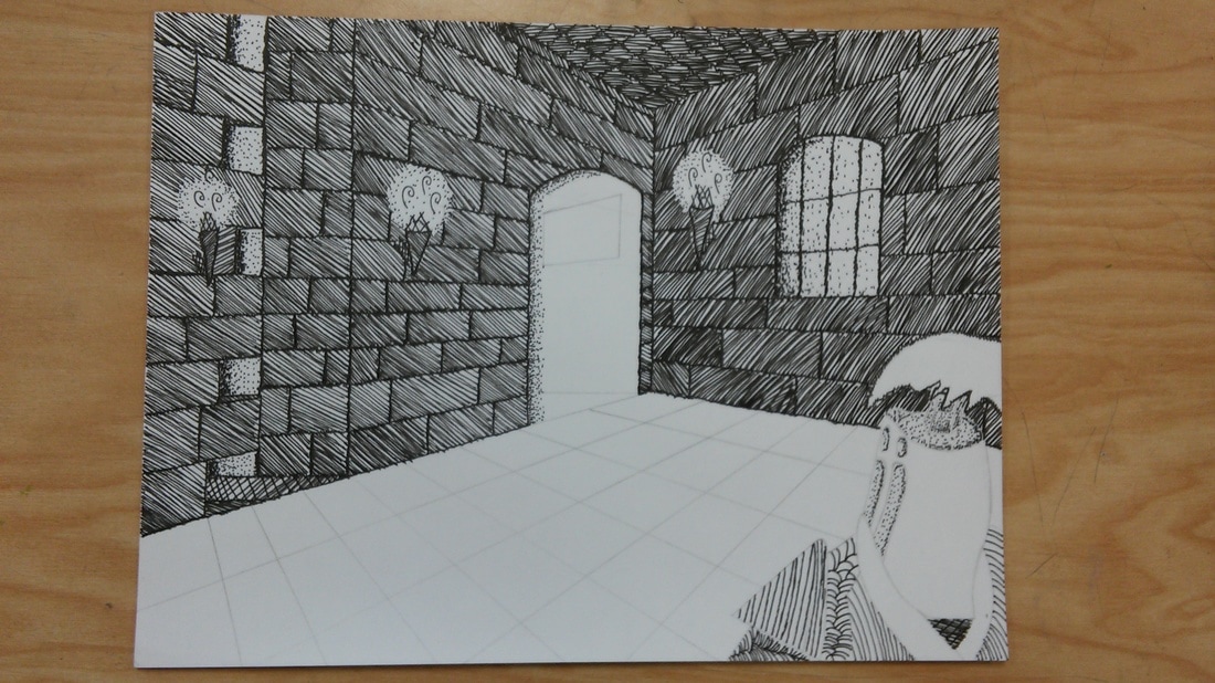
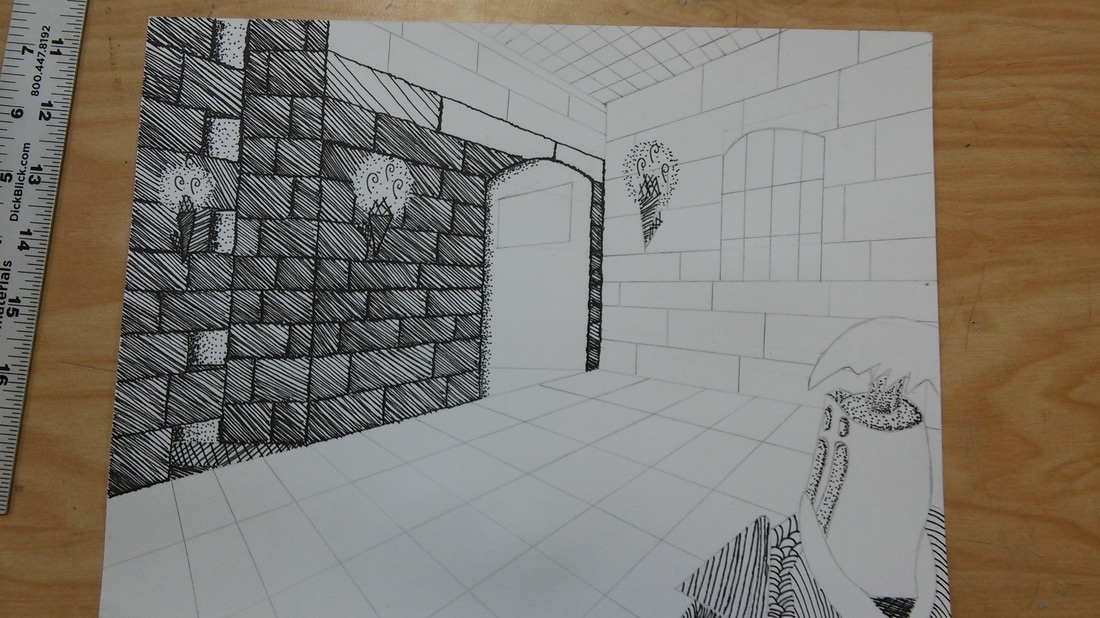
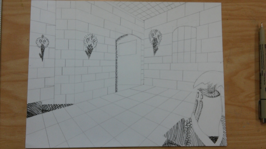
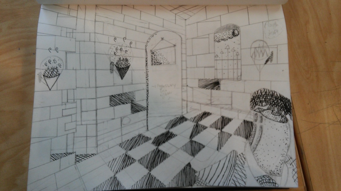
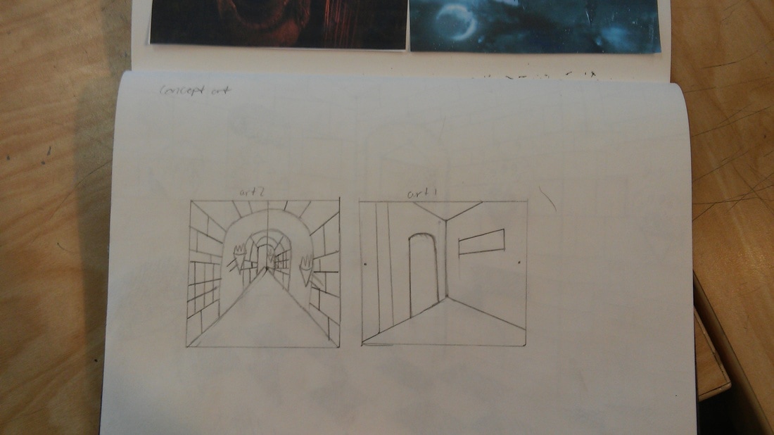
How did you use perspective? Why is perspective important?
I used the corner perspective because in my head it had come more clearly. The reason why the perspective was important was because thays how i came up with my pictuer i drew.
How is texture important in your composition?
I was wanting to have a feeling that that the person in my drwing was in a dark room at night trying to the next room.
Why is value so important in this project?
It was to show lighting, textuer of aged bricks and stuff around that is slowing falling appart.
Describe your craftsmanship (How well the project is crafted technically)
i thought it came out great but a couple of spots here and there i messed up which got me a little mad but for my first drawing i thought i did a fine job.
If you could recreate your piece what would you do differently to enhance your final outcome?
I should of been a little mote careful when i was putting my lines down with the pen.
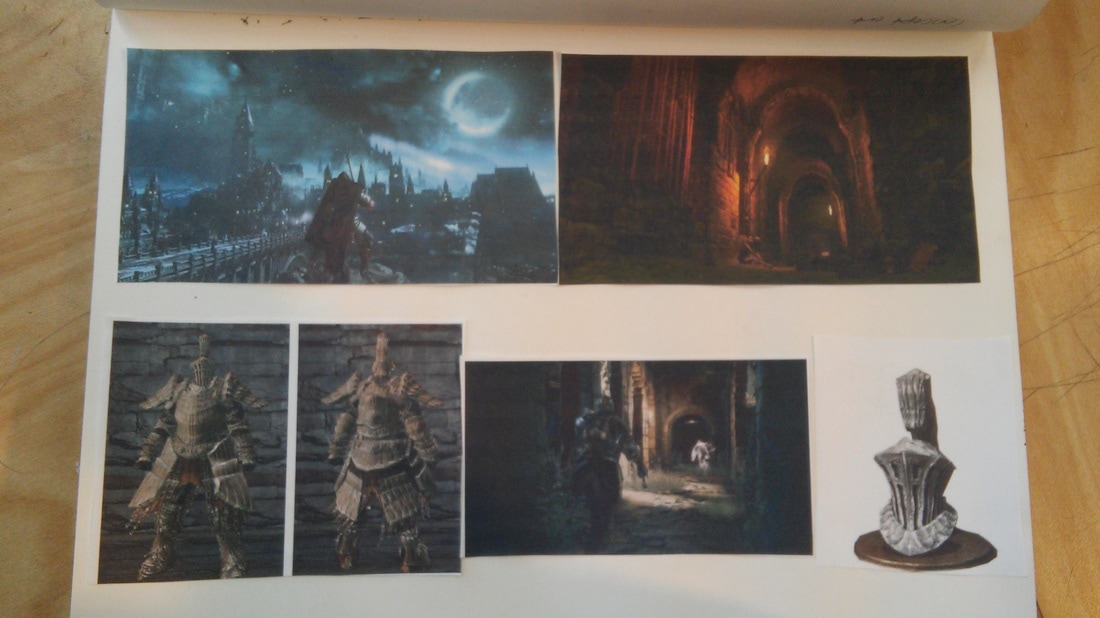
(Only answer if you did fairytale) Which Fairytale or Fable did you create?
How did you represent the story in your own way? Knight in a castle, i kinda used pictuers and ideas of my own using a corner perspective, to make a nice room falling apart.
When applying the pen and ink techniques why and how is it important to make sure you understand the concepts taught in class?
Because if you do not keep track of the lines and the room the concept of the pictuer is ruined. And aswell well you to to keep track of the patterns.
As a growing artist how do you think what you have learned will guide and better your future projects.
Now that i understand the perspectives and what type of lines i can use and build to keep track of what im doing.
i chose to use more becuase if i used only one technique it would not have been bland. And as well i liked to do the hatching and the dotting.
How did you use perspective? Why is perspective important?
I used the corner perspective because in my head it had come more clearly. The reason why the perspective was important was because thays how i came up with my pictuer i drew.
How is texture important in your composition?
I was wanting to have a feeling that that the person in my drwing was in a dark room at night trying to the next room.
Why is value so important in this project?
It was to show lighting, textuer of aged bricks and stuff around that is slowing falling appart.
Describe your craftsmanship (How well the project is crafted technically)
i thought it came out great but a couple of spots here and there i messed up which got me a little mad but for my first drawing i thought i did a fine job.
If you could recreate your piece what would you do differently to enhance your final outcome?
I should of been a little mote careful when i was putting my lines down with the pen.
(Only answer if you did fairytale) Which Fairytale or Fable did you create?
How did you represent the story in your own way? Knight in a castle, i kinda used pictuers and ideas of my own using a corner perspective, to make a nice room falling apart.
When applying the pen and ink techniques why and how is it important to make sure you understand the concepts taught in class?
Because if you do not keep track of the lines and the room the concept of the pictuer is ruined. And aswell well you to to keep track of the patterns.
As a growing artist how do you think what you have learned will guide and better your future projects.
Now that i understand the perspectives and what type of lines i can use and build to keep track of what im doing.
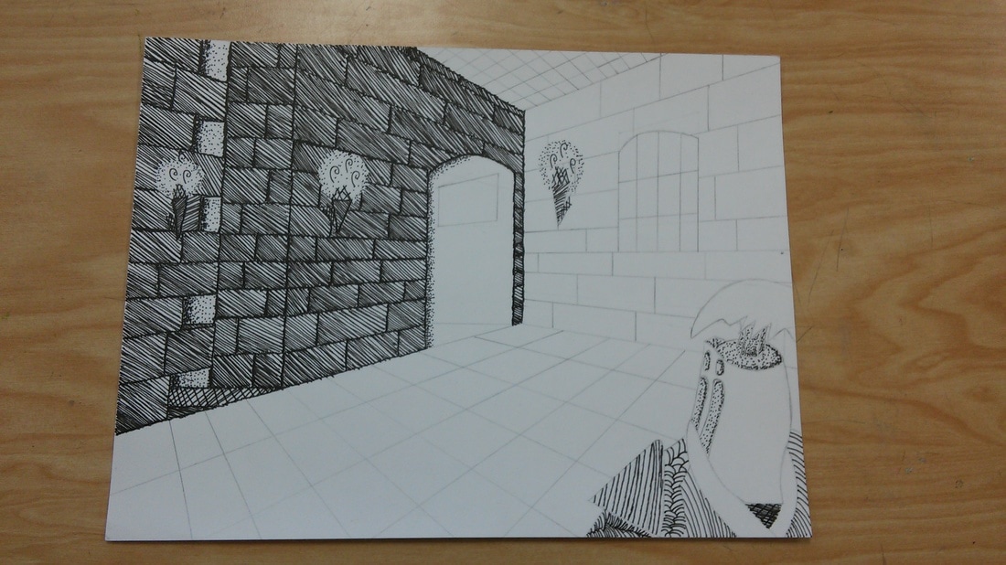
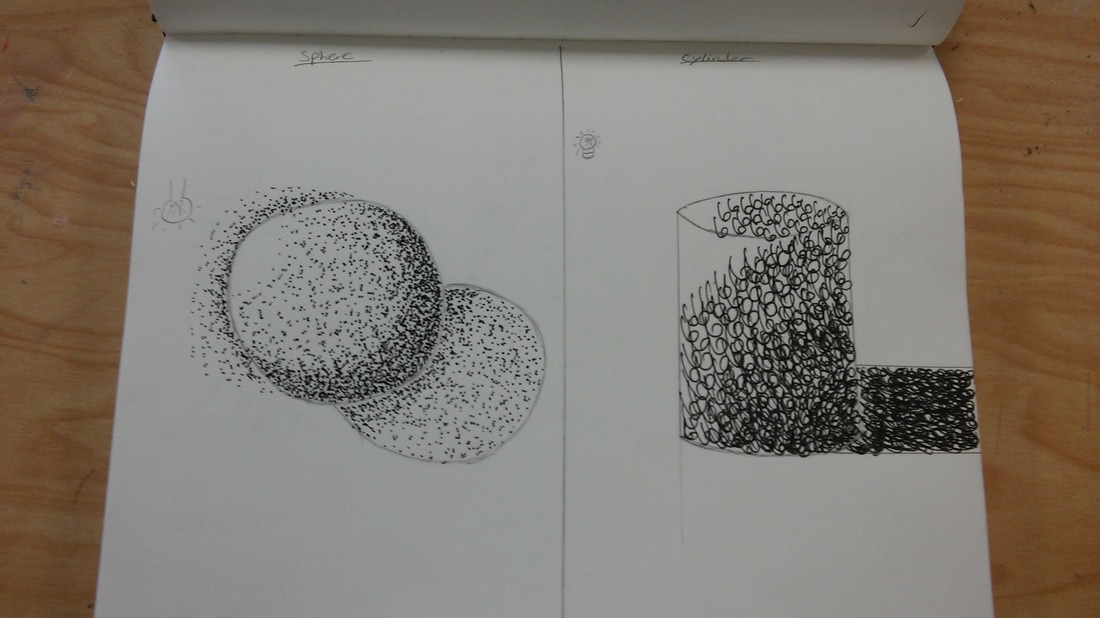
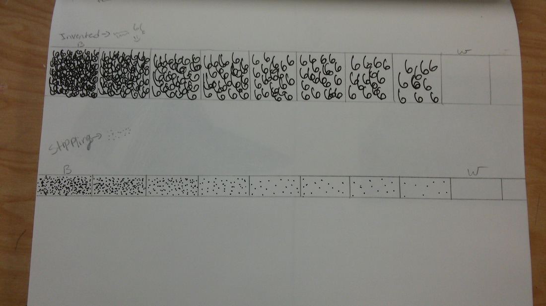
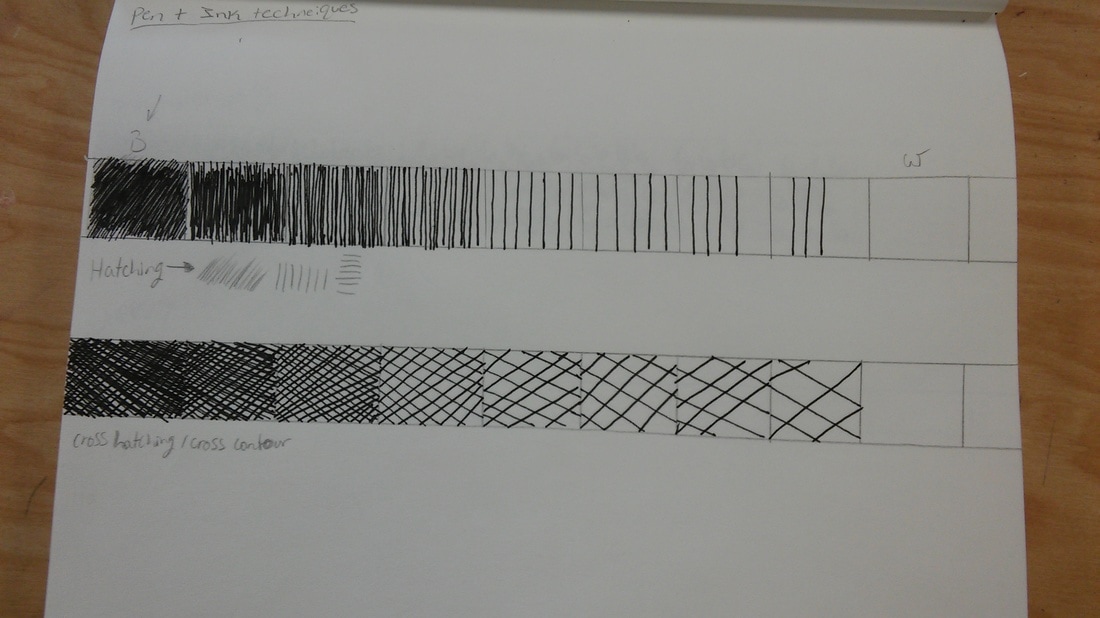
i dont know why but i enjoeyed the dotting because it made the pictuer look more realisitc and popped out more. and the inverted was cool because with your idea you could perform the dame techinque but with your style to it.
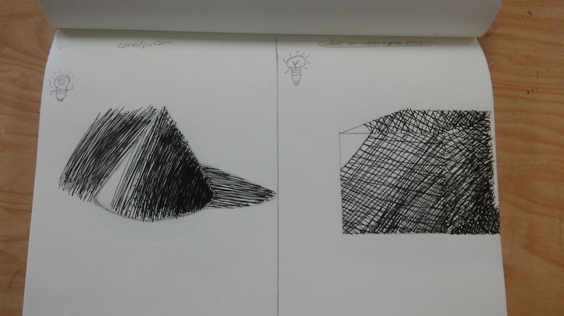
hatching the trignale i thought was cool and helped me learn that the more lines are closer the darker it becomes. and then the cross hatching was a bit harder because you kinda had to be a little bit more precise on where the lines where at.
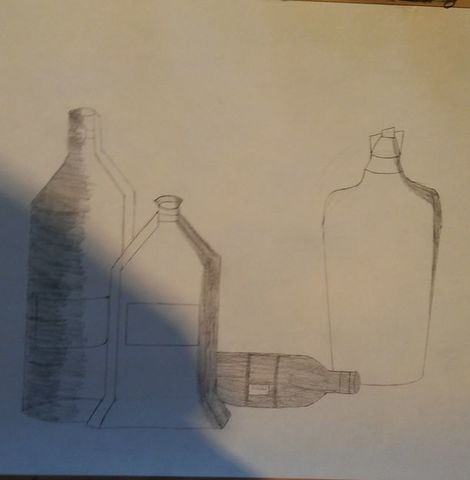
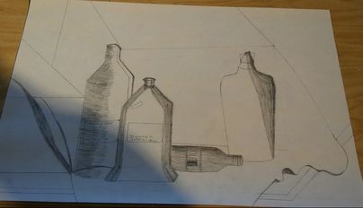
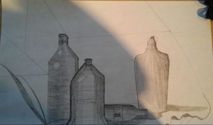
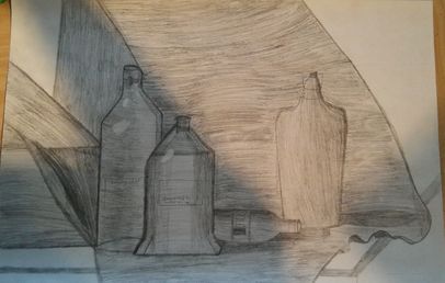
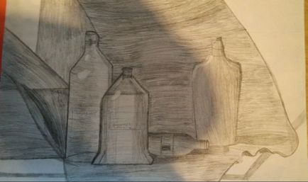
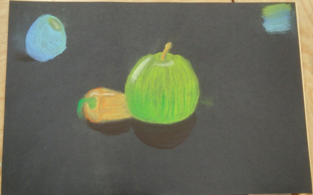
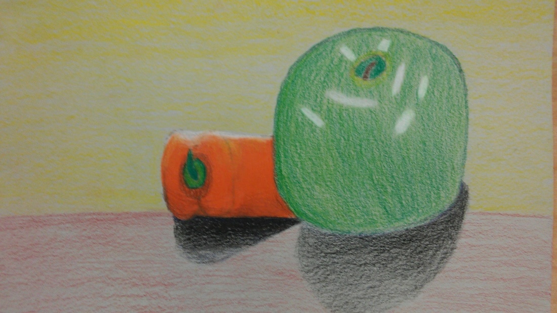
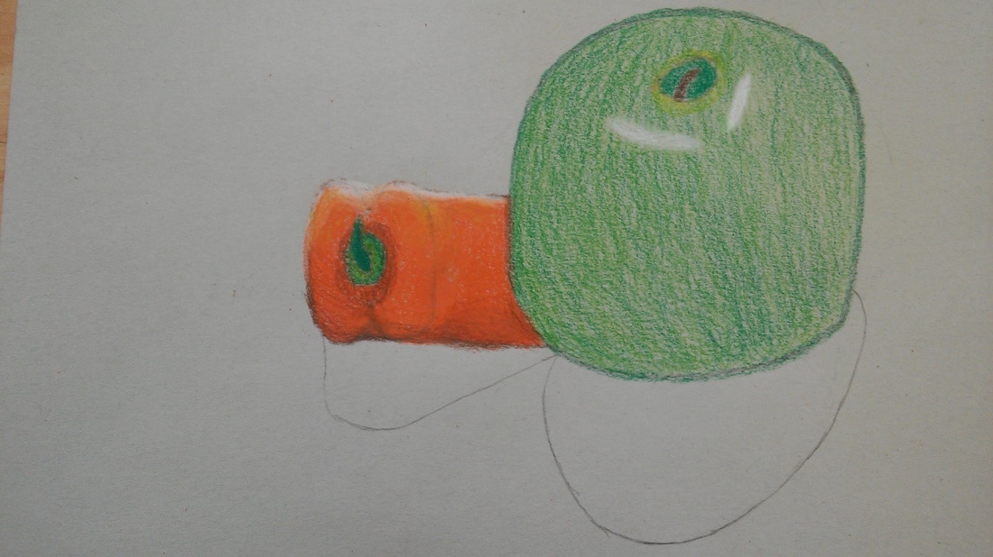
Describe how you arranged your composition. Discuss your use of the elements and principles. Is it a successful composition?
I arranged it in darker and lighter spots in my drawing. I tried to draw them 3D and shape from front ground and back. I think over all if was a success.
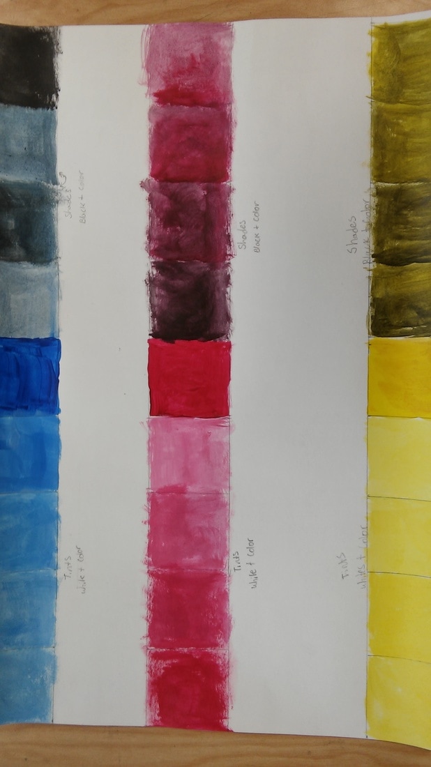
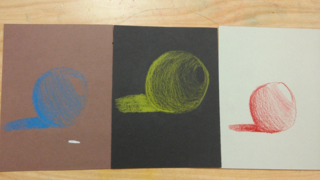
Did you use a wide range of values? (A range from white to black with at least 9 values). Explain how is this evident?
Yes because without going really dark or really light you cant see the depth of each bottle and the back ground.
Explain how your knowledge and creating practice studies with value contributed to your piece.
From art 1 it helped with my knowledge on how and why artist do the type of coloring as they do.
Describe the blending and transitions in your objects (discuss your use of pressure with pencil and other techniques to achieve this).
I went from a lighter shade then to a darker shade here and there for depth in order to show what is closer and what is futher back.
Explain how your interpretation of texture is essential in capturing the look of the object.
I tried my best when showing the crickles in the fabric and the light showing off the bottles.
If you could recreate your pieces what would you do differently to enhance the final outcome?
Try to shade better,find better textuers, give it more depth and shading more equally
I arranged it in darker and lighter spots in my drawing. I tried to draw them 3D and shape from front ground and back. I think over all if was a success.
Did you use a wide range of values? (A range from white to black with at least 9 values). Explain how is this evident?
Yes because without going really dark or really light you cant see the depth of each bottle and the back ground.
Explain how your knowledge and creating practice studies with value contributed to your piece.
From art 1 it helped with my knowledge on how and why artist do the type of coloring as they do.
Describe the blending and transitions in your objects (discuss your use of pressure with pencil and other techniques to achieve this).
I went from a lighter shade then to a darker shade here and there for depth in order to show what is closer and what is futher back.
Explain how your interpretation of texture is essential in capturing the look of the object.
I tried my best when showing the crickles in the fabric and the light showing off the bottles.
If you could recreate your pieces what would you do differently to enhance the final outcome?
Try to shade better,find better textuers, give it more depth and shading more equally
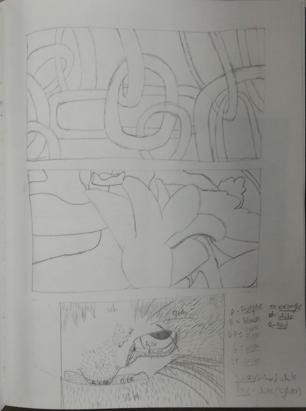
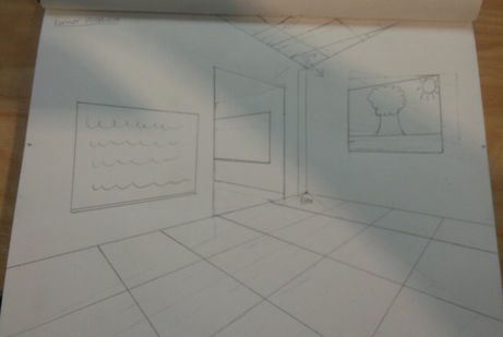
This is a corner perspective. Basically we choose a side of the wall and work from the cornor of it by using 4 dots and placing them in specific spots to balance out all of the corners and flooring aswell as the roof.
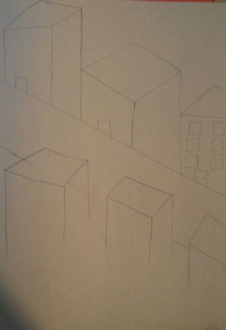
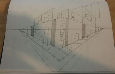
this is an ant perspective . it kinda shows a cartoony building from the bottom. i kinda had some trouble on it but its a interesting perspective to draw by.
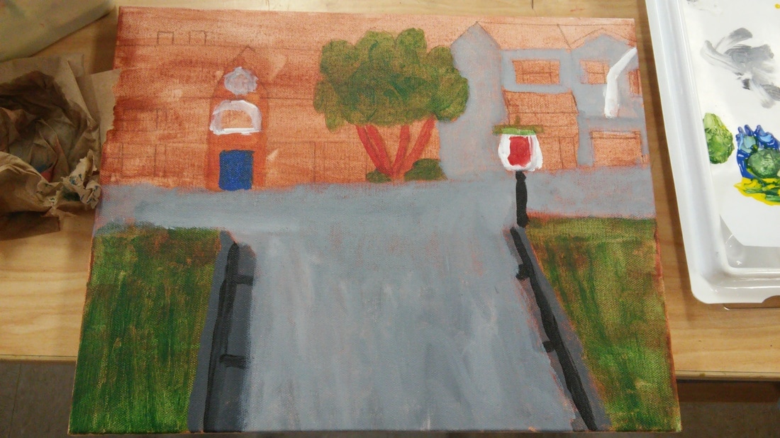
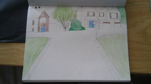
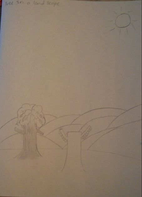
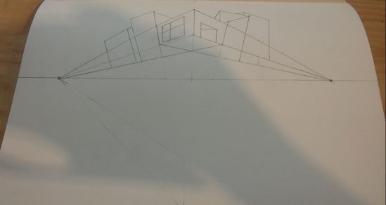
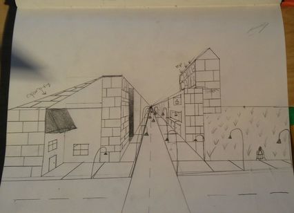
this is my 2 point perspective. what i did was it tricks the eye that yout see the cornor of the street.
this is my 1 point perspective. i had add details of farker and lighter spots to make it look like you can go behind it.